Thursday, October 28, 2010


Wild Dreams and Bedouin Babes

Katie Mossman is the gorgeous and talented daughter of my Dad's girlfriend, Susan. Katie is a fashion stylist whose work frequently appears on the pages of Harper's Bazaar US, Vogue Germany, Numéro, Numéro Tokyo, as well as other top fashion magazines. She recently  put together these incredible looks with a nomadic theme called "Wild Dreams" for the November 2010 issue of Vogue GermanyThis rich and radiant collection of Bedouin costumes shows Liu Wen in chunky jewelry, fur and fringe frolicking below a clear blue sky and cool white sands.

I WANT THIS COAT! Liu Wen styled by Katie Mossman, photographed by Greg Kadel
Liu Wen styled by Katie Mossman, photographed by Greg Kadel
The lovely Katie Mossman Via


Monday, October 25, 2010

One last Glimpse of Summer . . .


The snow swirled around outside my office in Boulder for only a few minutes this afternoon. But, surely bigger flakes are just around the corner. I came across these photos on my friend and former colleague, Melissa's, Facebook page. Her recent honeymoon in Greece looks so lovely but oh-so-far away from our arctic winds. I recognize Santorini immediately as I spent part of an incredible summer there two decades ago. 

I shan't look under summer's covers anymore. 


Friday, October 22, 2010

Nighty Night in New York

An old, dear friend of my husband's is coming soon to visit us for a long weekend. Cameron and his lovely bride, Melanie, will see our little corner of the world which is quite different from Manhattan, their beloved city. Thinking about their upcoming visit reminded me of our fabulous springtime trip to the city that never sleeps. We stayed at Hotel Indigo, located in the heart of Chelsea. What was quite surprising, is although it is a small chain hotel, it has the distinctive feel of a small, luxury boutique hotel. Their standard room typically goes for $300+ a night but we found a special sale on quickbook.com for only $140 per night! What a deal. The service was excellent, the rooms are outfitted with bold and funky over-sized graphic photos, actual wood floors and contemporary bathrooms. There is even a roof top deck - which somehow managed to elude me this last time but not the next!

Standard guest room. Free WiFi, incredibly comfortable beds and pillows makes me a fan forever. Via
Guest Suite; same great design, just more of it! Via

Curb-less, door-less showers and under-mount sink give a spacious feel of what is actually a small room. Fluffy towels rolled up on a teak stool is nice touch. Via
The roof top bar. Via
Food and drink in the night sky. Via
The traditional exterior belies the contemporary interiors. Via


Thursday, October 21, 2010

Breaking the Concrete Mold

Designer, Fu-Tung Cheng, has changed our attitudes on concrete. He has helped the American public at large view concrete as something beautiful and worthy enough to be on the kitchen counter next to granite. He has written Do-It-Yourself books, designed several concrete fabrication products, sells related products, and even hosts workshops and seminars for the homeowner and the professional on concrete. Cheng believes his chosen medium satisfies a primal human need for solidity. He has even designed a whole home based around concrete. And that is one solid home. Take a look:


The Entrance boasts an extra wide zinc clad door that pivots. Via

Via
The foyer welcomes you with a bright red and yellow wall. Via

The bright colors punctuate the cool interiors. Via

The living room completely opens up to the backyard with a stacking window wall system. Via
The free form pools soften the hard edges of the concrete. Via
To read the whole story visit the link at Custom Home Online. To learn more about concrete and the DIY projects go to Cheng's comprehensive website: Concrete Exchange.

Wednesday, October 20, 2010

Shower Down on Me

I'm contemplating all of the changes I'd like to do to our bathroom. I should be concentrating on finding just the right baluster for our staircase since that's the project at hand (I hope my husband doesn't read this). But, I'm jumping ahead to the change that will really make a difference in our daily lives - a new, light and bright, clean and crisp bathroom. Now, I have always derived a great deal of satisfaction in cleaning anything chrome. Not that I particularly like chrome; it's the instant gratification that I get when I end up with a bright, gleaming finish after just a few wipes. But what if you didn't see the water spots? What if you didn't have to wipe off those nasty marks everyday? That would be even better. Moma Design's shower head could solve the problem. It is made out of Corian, a solid surface material requiring little maintenance.

What a concept.

I could always find something else to clean.

Docciacqua Via Moma Design

Via Moma Design


Tuesday, October 19, 2010

Rainy Fall Weather makes Me Feel a bit like this . . .
Our last summer day was Saturday. Yesterday, the weather turned its temperature down and the sky started to cry. I'm feeling a bit like this . . .


Monday, October 18, 2010

Edible Dirt and other Delicacies

I love to eat. Absolutely, love it. I am, hands down, the pig in our family. For that reason, I am also the cook. So, I am always impressed when someone can not only concoct a delicious meal, but make it a visual feast as well (I usually am too concerned about getting the food into my belly to take the time to make it look good). René Redzepi, chef of Noma in Copenhagen, excels at both. Noma was just named the best restaurant in the world in San Pellegrino World’s 50 Best Restaurants 2010. But, what I found the most intriguing amongst his unrelenting gastronomic creativity, was his edible dirt. 

Via
 The dirt is actually a mixture of malt and hazelnut flours. Not a Noma exclusive, edible dirt has also been dug up at Manhattan's Gilt, made of both  mushroom soil and charred-onion ash. But, unlike Gilt's over-the-top opulence, Noma  is a quiet study in texture. Warmed  only by wooden beams and the occasional fur pelt tossed over a chair back, the Nordic minimalism has an almost primal feel to it. Like René's belief that food should be "more raw than cooked," the dining room is just that; finished, but a touch raw, and not overdone Located seaside in a 250 year old industrial complex, converted from a derelict eighteenth-century warehouse into lofts and large open spaces in 2003, the focus is on the food. No fancy flatware, no designer linens, nor expensive floral arrangements to distract you. In the end, the pretense of Gilt is not nearly as appetizing as the understated Noma.


Noma's unpretentious entrance. Photography by Ditte Isager
Three years in the making, René's latest cookbook, Noma: Time and Place in Nordic Cuisine, has just been released this month. Photographer Ditte Isager, whose inspiration comes from the light in the Dutch masters, justly reflects the unassuming simplicity of the food and the space in which it's served. I haven't bought a cookbook in years, opting to peruse the pages of the internet for my recipes rather than an actual book. But, the combination of alluring photographs and the secret to making my own dirt, may just make its way to my shelf.

"Amuse Bouche" Via
I love using Nasturtium leaves in floral arrangements. Their addition to the wild mushroom and elderberry caper would give the appetizer a peppery bite. Via

Steamed spinach and Tea Rose Hips Via


Sunday, October 17, 2010

Bath-A-Holics, Unite!
If you’re addicted to the pleasures of a long hot soak in the tub, this post is for you!  Can’t get enough of that bubbly stuff?  Look no further.  Fresh new tub designs from three companies caught my eye this week- take a look.
First, feast your eyes on these Thol tubs.  The high backrest and big-bellied design make it look a bit like a pregnant Viking, but just imagine leaning back in this big beauty to enjoy a glass of wine and a good book- no bath pillow needed!  Looks like a comfy place to soak away your cares…
Via Studio Thol

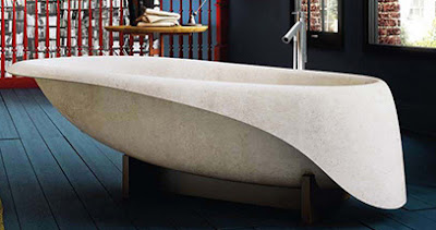
If you like a sleeker, more contemporary look, check out this clear glass creation by Glass Idromassaggio. There’s also a free-standing concrete tub featured there that I found interesting; a contemporary creation inspired by the sea with fluid lines and a beautiful finish. I found them on the Trendir website, and loved the minimalist feel and elegant lines of these tubs.  
Glass Idromassage via Trendir
Want a warmer, more natural look?  Try this new wooden tub from MAAX, a limited edition Viaggi with buttery-smooth curves and a silky finish.  Their free-standing egg-shaped tub is the perfect centerpiece for any master bath, and its natural materials make it a smart choice for eco-conscious designers.   Luxe, yet simple, this versatile creation is well-suited to accompany stone, tile, glass, marble, chrome, and other finishes.
Via Moco Loco

Condor, a French company, specializes in luxurious creations that incorporate non-traditional materials into their tub designs, like leather and wicker.  Their website features some great photos- they’re the Louis Vuitton of tubs.  I particularly liked the “Baignoire Paris,” inspired by a travel trunk.  This gorgeous tub features brass jets and fittings, a removable leather cushion, and is finished with a brass fleur-de-lis.  Bon Voyage!  

Via Condor

Saturday, October 16, 2010

Seriously Serene Stone and Wood Interiors

Despite the 80 degree weather we had here in Boulder yesterday, I'm no longer in denial. It is finally Fall. Well, actually, it's been Fall for a few weeks but I wasn't able to admit it. I still don't quite crave my sweaters, and, we're going to a neighbor's party this afternoon to celebrate the last hurrah of summer. But, like a cocoon, these serene stone and wood interiors are drawing me into the comforts a home offers during the cold months. They remind me of peaceful evenings, lingering with friends over homemade pasta and waiting for the snowflakes to fall.

Via Mell Lawrence

The simple materials of this kitchen are exquisite. Earthy; yet clean, light and bright.

Via Mell Lawrence

We're updating our Seventies era, golden oak wood floors by staining them a deep "mahoganish/rosewood/brown" color. In order to keep the space open and bright, I want to use lighter colors on the fireplace surround. This is my inspiration. The light, warm tones of the natural materials and simple forms give it a modern, yet timeless appeal.

Via Trendir

Even a large home, a plan this straightforward feels organized and manageable.
Via Trendir

As with all of the other spaces, the exposed structure of the wood ceiling gives an inviting and unpretentious look to this kitchen. This house has a more country feel, but it is still uncomplicated, free of unnecessary adornment.

Via Trendir

On Monday, I'll schedule our floors to be stained a deep brown and get one step closer to a modern, but cozy home. Then, I'll look for my sweaters, pull out my squash ravioli with brown butter sauce recipe, and invite some friends over to linger.

If you want to update your home to be modern, yet inviting, call me and I'll help you achieve the perfect cocoon.

Friday, October 15, 2010

Harrowing Halloween!

And, what shall you portray this All Hallows Eve? Horribly hideous or delightfully delicious? If you're at a loss, perhaps these will help spur your imagination . . . 

This is how I felt this morning. Perhaps, I don't need a costume. I might just be ready.

The Mummy. Via Martha Stewart

If you face looked this bad, you wouldn't even have to add bones to your outfit. Just wear black and you're good.

The Skeleton. Via Martha Stewart.


I could not do this. No way. I don't care if they're plastic, with my mice phobia, I can't even pretend. It just creeps me out.


Mice Infestation. Via Martha Stewart

This is just kind of funky and fun.


The Birds Nest. Via Martha Stewart.

. . . or else you could be nostalgic and look toward vintage Halloween attire. If you don't want to actually look bad on Halloween, what about being The Haunting Housewife? Drape yourself in gauze and just add a touch more white powder to your face for a truly ashen appearance.

The Haunting Housewife. Via Country Living

The Mortician is easy to pull off with just a few touches from a vintage clothing and costume store. In the Denver/Boulder area, visit Candy's Vintage Clothing and Costumes for the best selection.


The Mortician. Via Country Living

If you're a gentleman that would like to look dashing, The Count may just be the ticket.

The Count. Via Country Living
Or a Poe inspired, sexy Raven . . .

The Crow. Via Country Living

Candy's Vintage Clothing and Costumes is a treasure trove of old and new costumes, vintage finds, jewelry and accessories to invent your perfect alter ego. Located at 2512 Broadway in Boulder, Colorado, Candy's is a bit vintage in itself, operating in north Boulder for over two decades. You'll find sixties sunglasses, massive dice earrings, fishnet tights, disco shirts, marabou boas, as well as old ball gowns, seventies leather jackets, and ruffled undies. It's the perfect place to rummage through for costumes . . . or just for fun!

Wigs, vintage styled jewelry, and hats crowd Candy's check out counter.

Totally wig out with dozens of styles and colors.

Via Candy's

As a skinny young girl, my mother cut my blonde locks into a pixie to fashion me after Twiggy, the original anorexic looking model of the sixties. Now that I have hair halfway down my back, and weight on my bones because I actually eat (and, quite a bit!), I could never pull off the Twiggy look anymore. But, if you could, one of these suitcases would complete the outfit. Find a round one, and you're golden.

Via Candy's

Visit Candy's! Not in Boulder? Call Jane, the owner, at 303.442.6186 and let her pull together the perfect accessories for you.

Via Candy's


Related Posts Plugin for WordPress, Blogger...