Monday, January 31, 2011

Mini Cooper Car Wraps

I love the Mini Cooper. My husband does not. He thinks it looks like a piece of Tupperware on wheels. But, I think they are cute and sporty without being intimidating or pretentious. The dashboard is my favorite part of the design. It seems to be fashioned after the dash of a classic single engine airplane.


A few years ago while in the market for a new car, the Mini Cooper was one of my front runners up there with the new VW Beetle and the Toyota Prius. I really wanted one. You could get the British flag image on the roof! The Prius looked like a Pit Bull, not one of my favorite dogs. But it touted the best gas mileage available. I couldn't really afford the British flag roof option but I could afford the black and white finish line flags printed on the side mirrors - cool! But, my stepson could barely fit in the Mini's back seat. Large dogs, which I hope to get again one day, would never be comfortable. Consumers Report listed the Prius's maintenance ratings much higher than the Mini Cooper. In the end, I decided upon the more sensible Prius.


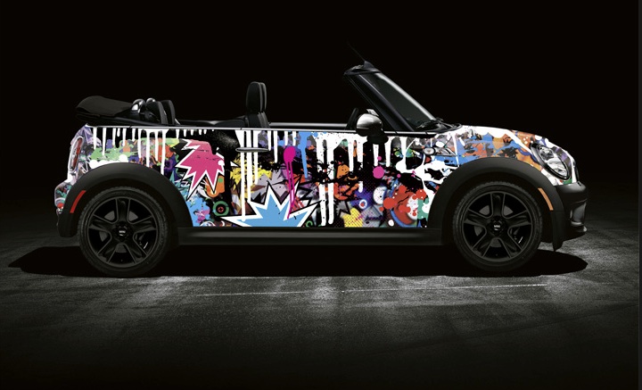
I like my Prius well enough but I still look longingly at the cute Minis zipping around town. And now that Cool Hunter is soon coming out with full body car wraps for the Mini Cooper, my jealousy, which I thought was dissipating, has just jumped a few notches!


Since the Prius has been a very popular car the last few years I'm hoping that Cool Hunter will soon offer a Prius wrap. I would definitely buy one. Are you listening Cool Hunter?


All photos via Access Agency. Check out other designs to be available at their website here.

Friday, January 28, 2011

Weekend Funnies

Thursday, January 27, 2011

Body Patterns


All images by fashion photographer,  Enrique Badulescu

Wednesday, January 26, 2011

Interview: Neil J. Rook, Graphic Designer

I came across Neil J. Rook's work recently on CleverCards.com, an online showcase for graphic designers. He graduated from the London College of Fashion after studying surface textiles. The freelance designer, illustrator and fashion enthusiast focused his schooling on the more graphical elements of fashion design like illustration and textiles because of his strong graphical aesthetic. I recently caught up with the London based designer to have him share a bit about his work.
What do you typically look for in a client for inspiration in designing for them? I always try to get a feel for what they want, either by talking to them, getting them to perhaps gather a few images or themes they might like or even details about my own previous work they might like. When designing for someone else it's critical that you listen to them and understand exactly what they want before you start thinking about things or ideas that you might have.
How to you begin your ideation; hand sketches, computer, other media? My normal process of working is that I'll have an idea in my head, I'll quickly jot it down on some paper or a post it or whatever I can lay my hands on, then I'll start to research things or collect images as visual aids. When I've done all that, I'll then open illustrator and get to work. I have lots of ideas/drawings/plans that never see the light of day though.
What tools do you use to create your work. What's your favourite gadget? I create everything I design with my mouse and Adobe Illustrator, sometimes with a little help from Photoshop. Some people find working with a mouse tedious but I find that it allows me to be as meticulous and precise as possible which is great for someone whose a slight perfectionist like myself.
Would you like to apply your graphics to products rather than just the packaging? If so, what would those products look like? Of course, like most designers and illustrators I'd love for my work to be on display in as many places as it could possibly be or fit, within reason. I'm not exactly sure what those products would be but I'd like to imagine they would be something fun and innovative. I think as my education is also fashion based it would always be nice to see my work on fashion based goods as well.
The branding of your work is very consistent. Do you only want to take work that would result in similar looks? I think it's important to be consistent, especially in design so people know exactly what they are getting and who you are as an designer or illustrator. I like the idea of people being able to see my work and identify it as mine without actually having to be told, I think it's good to have that branding and style. I'd like to think I'm pretty open to most or all types of work though.
Your work looks like a party. It reminds me of Colorforms that i had as a child. Do you ever do anything on the dark side or a bit more serious? (Laughs), thank you. I think that the world in general is so serious that I don't particularly want to do anything majorly serious or dark. Maybe for me design and illustration are ways to escape all of that and just have some fun. Sometimes you just need a party and if my work is a party and brightens someone's day then I'm quite happy with that! 


All images courtesy of Neil J. Rook. To see more of his work, visit is website here. Neil also writes a blog, Ennsense, on fashion, design and architecture. 

Tuesday, January 25, 2011

Holiday Getaway; Le Clos Saint Saourde

I'm attracted to natural materials; stone, wood, zinc . . . with calming monochromatic finishes. Nestled into rocks and surrounded by vineyards, Le Clos Saint Saourde sounds like the perfect way to relax in the heart of Provence.  Built the 18th century, it welcomes you with its charming rooms, heated salt water pool and exceptional views.


Monday, January 24, 2011

Eric Owen Moss's Corner of the World with the Addition of Samitaur Tower

Looking like five Suessian hat boxes balancing precariously on top of each other is the Samitaur Tower located in a burgening Culver City, California. With views of many of architect Moss's 15 other ingenious buildings located throughout the city, the tower sits adjacent to a new light-rail line, under construction and expected to open by 2012. With a projected daily ridership of 27,000, this new infrastructure brings with it a large, and largely captive, audience.


Developers Laurie and Frederick Samitaur Smith have spent 25 years developing this once-blighted section of Culver City into an urban center of art and culture. The tower will be used as a viewing platform to overlook the city, but its primary objective is to distribute art and other relevant content to the local and the in-transit audiences passing by. “We wanted to stabilize the neighborhood, and introduce jobs, architecture, and art,” Frederick Samitaur Smith says told Architect Magazine. 


Part Dr. Suess, a touch of Mad Max with a hint of Water World, Samitaur Tower’s form is defined by five offset steel rings, which are cantilevered off of steel beams at the rear. The gap between each ring level is bridged by differently shaped panes of a milky colored acrylic and optical-film assembly, which, when viewed together, form an irregularly shaped rear-projection screen. Riders of L.A.'s imminent light-rail line won't need to rely on their iPads for entertainment. The panes of acrylic serve as projection screens, which will showcase films and video art for commuters' pleasure.


The programming for the Samitaur Tower's five screens is still under consideration, but whether it's Van Gogh's Starry Night or a classic film on display, everyone will have something to watch. The different screens were engineered and oriented to cater to different audiences: one to drivers, one to pedestrians, another to passengers of the light rail, and still another to people sitting on concrete bleachers in a below-grade amphitheater. {Via Architect Magazine}


 Read more here and see other works by architect, Eric Owen Moss at his website.

Saturday, January 22, 2011

The Weekend Funnies: Dog Glasses

Yes, there are such things! I came across this hilarious photo by Julia Brokow on A Cup of Jo's blog. It reminded me of my dearly beloved dog who has since passed, Taylor (aka, Taylor the Junk Yard Dog, Taylor-boy, Taylor-dog, Super Dog). He, too, was a very serious and tolerant black lab. Taylor had many sensitivities, one of them being his eyes. He, along with his brother, Sebastian (aka, Saint Sebastian of Littleton, Sebaninski, Sabbie) accompanied me in the intense Colorado sunlight for hours on end at many horse shows with my equestrian boutique, HorseSportif. I actually found some dog sunglasses by Doggles but Taylor wanted no part of that. He didn't like the lovely (and expensive) Burberry coat I bought him either. I guess he just wanted to be a dog.


I love the serious look on his/her face. And so patient, sitting there while the picture is taken!
These puppies are learning at a young age to put up with such human craziness. Via Doggles

Friday, January 21, 2011

Media Rooms

If you're fortunate enough to have enough space to dedicate space solely for a media room, why not fill it with rich, deep colors and oversized furniture? Winter is the best time to sink in deep sofas filled with cushions and comfy throws and immerse yourself in your favorite movie. Grab some popcorn and sit back and enjoy the show.
Turner Davis Interiors, Benecki Fine Homes


Candace Olson via DecoPad

Wednesday, January 19, 2011

{Via}

Chalkboard Paint
For years and years, I've wanted to have chalkboard walls. More than anything, I just love the look of the matte, dark gray. At my first job out of college, I tried to incorporate chalkboard walls into a project, any project, and would have if I had been able to find anything other than premanufactured typical school boards. I've never put them in any of my own homes; it just hasn't fit into the design and layout. Now, chalkboard walls are easily attained with the simple stroke of your brush using chalkboard paint. Many years after my first search, chalkboard walls are quite mainstream. Even West Elm put chalkboard walls on their latest catalog cover and ELLE Decoration South Africa is coming out with a large wall in a kitchen. But what hasn't been explored and used nearly as much are colored chalkboards. Hudson Paint has about the widest variety of fun, hip colors that show tons of promise for future interiors.


TIPS:

  • In order for the dark gray chalkboard walls to work, balance them with plenty of other light colored surfaces.
  • Make them functional! Put them in a location where you'll put them to work such as in the kitchen to write grocery lists, family notes, or just fun doodles!


The neutrals first:
{Via}

{Via}


Annaleena's own home via her blog, HEM

Annaleena's own painted painting and painted animals. Via her blog, HEM

Via Jake Curtis, Photographer

Via M Comme Maison

Via Vintage & Morrhar blog


Hudson Paint Colors and Ideas:

Hudson Paint Color Palette
Tivoli Bread and Baking Company via Hudson Paint
A child's room via Hudson Paint

Tuesday, January 18, 2011

Cream Colored Coffee
I love the thick colored monotone interiors photographer, Jake Curtis, has captured. Shades of one muted color always warms the heart.

Photos via Jake Curtis

Monday, January 17, 2011

No-Iron Tablecloth
I am in need of a no-iron tablecloth. Rather, my husband is in need of one since he is the one who kindly offers to iron them whenever we have a dinner party. I don't know who makes the tablecloth shown in designer Anne Coyle's room but it has the perfect rumpled look while remaining elegant. And no ironing! Of course, the animal print upholstered chairs and sherbert candy colored candles add to that effect.
{Via}

Here is another room designed by Anne Coyle. Glamorous and colorful without taking itself too seriously; the graphic rug adds a bit of funk to the otherwise traditional furnishings. There are the candy colored accents again.
{Via}

Related Posts Plugin for WordPress, Blogger...